Monday, 29 February 2016

Static Blue in the Bay

 Where is Amy?!
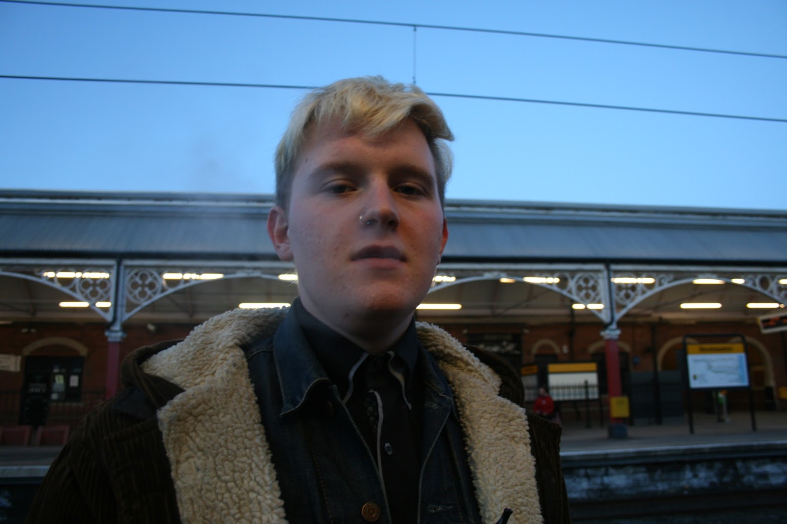
Bassist Louis Clark is the youngest and coolest.
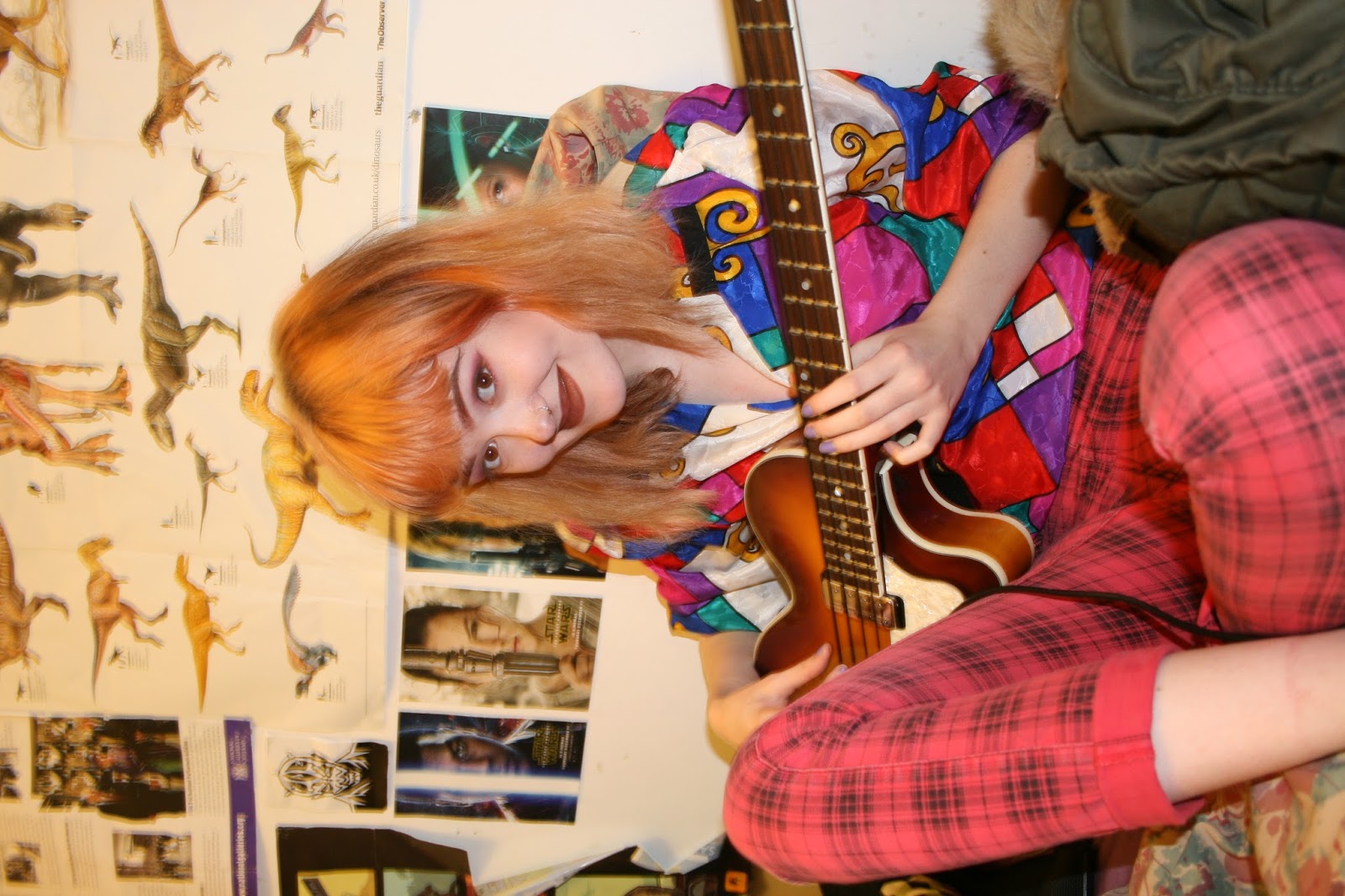
"Fran McKlaren" singer/songwriter and guitarist
 Sunglasses at night…
 We found Amy!
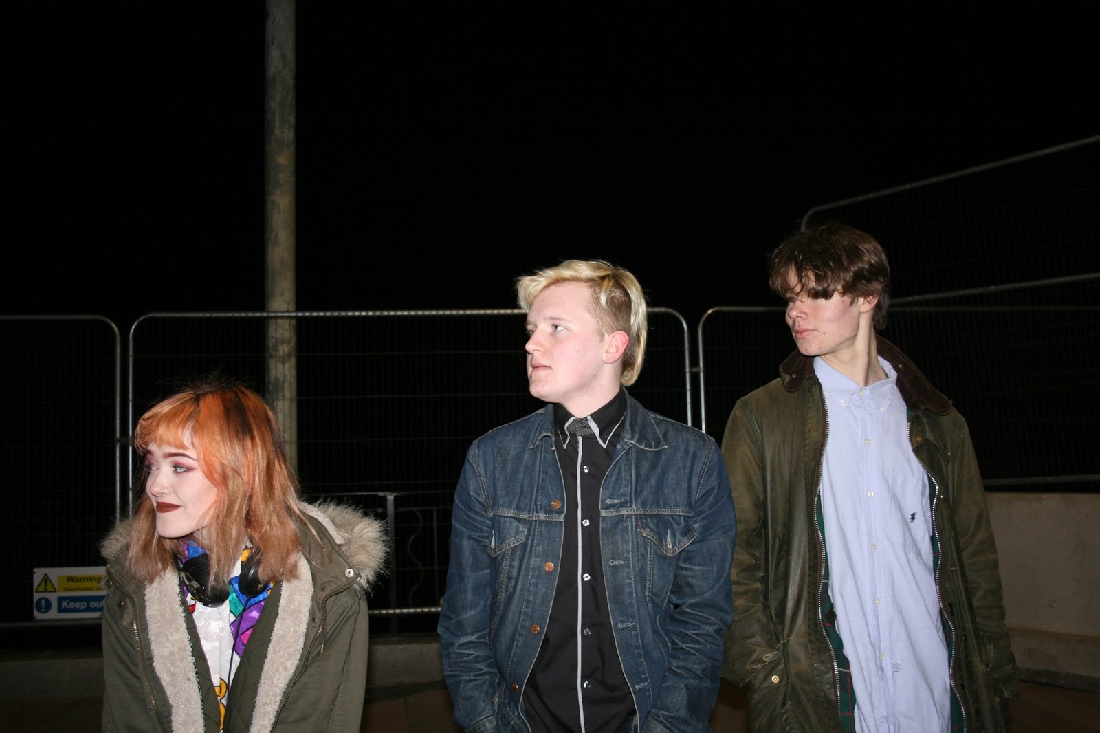
 Why're y'all so far apart? Do you hate each other?!
yes
There's a fire engine! Quick take a photo!
Stand up Straight Louis!
Jamie's door... A north eastern iconic spot.


Sometimes getting them to behave was a challenge
"Lets look like a Christian rock album cover"
Jamming Session
Newest band member and second bassist Amy Crozier is a little camera shy.

Sunday, 28 February 2016

Q and A

As I have to create a contents page I'm going to analyse a Q contents page to find the other conventions of other music magazine contents pages.

In this Q contents page there is 2 photos with short description of the articles to the left in a Features box with an Every Month box and a Review box below. This gives the page a blocky, square aesthetic (ewww). The articles have the page numbers next to them and the cover article is in gold instead of red, which contrasts to the red, black and white colour scheme. 
The images have little article descriptions and page numbers on the like the NME contents page.
The title is just contents with the Q logo in a plain bold font which has a modern feel.

In my magazine contents page I will also use short descriptions of the articles with page numbers next to them but instead of the blocky look I will use a photo of 1 person and use a similar format to MOJO.

Saturday, 27 February 2016

Ugliest contents page ever

As I have to create a contents page I'm going to analyse a NME contents page to find the other conventions of indie music magazine contents pages.

In this NME contents page there is 7 photos with short description of the articles they're promoting beneath them. This gives the page a blocky, square aesthetic (which I don't really like). The photos have the page numbers next to them and at the bottom there is a "Plus" section with other articles in the magazine mentioned. 
As well as that there's an advertisement to subscribe to the magazine in the bottom right.
The title is in a classic, old style font just saying "inside the week" with the date of the issue beneath it.

In my magazine contents page I will also use short descriptions of the articles with page numbers next to them but instead of the blocky look I will use a photo of 1 person and use a similar format to MOJO.

Thursday, 25 February 2016

What is this content...

As I have to create a contents page I'm going to analyse another MOJO contents page to find the conventions of indie music magazine contents pages.

In this MOJO contents page there is a photo of one person with the Features and Cover story details to the left of him moulded to his body. The page numbers are all even and to the left. The photo is taken from above looking down at him which makes him seem small and childlike.
The magazine name is at the top of the page with small details about it beneath and the date and issue to the left and right. 
There is also a quote from him at the bottom left of the page under the contents giving an idea about what his article is about.
The colour scheme of the page follows the rule of 3 with black, gold and red.

In my magazine contents page I will also use a single figure with the features and cover story details to the left and with my magazine title across the top of the page with the date and issue to the left.

Courtney loves MOJO

As I have to create a contents page I'm going to analyse another MOJO contents page to find the conventions of indie music magazine contents pages.

In this MOJO contents page there is a photo of one person with the Features and Cover story details to the left of her moulded to her body. The page numbers are all even and to the left.
The magazine name is at the top of the page with small details about it beneath and the date and issue to the left and right. 
There's also a quote from Courtney Love on the bottom right covering a bit of her image.
It follows the rule of 3 with red, white and black as the colour scheme and Courtney taking up 2/3 of the page.

In my magazine contents page I will also use a single figure with the features and cover story details to the left and with my magazine title across the top of the page with the date and issue to the left.

Wednesday, 24 February 2016

Florence and the Machinima

As I have to create a contents page I'm going to analyse several different contents pages from different magazines to find out the conventions of indie magazines.

In this MOJO contents page there is a photo of one person with the Features and Cover story details to the left of her moulded to her body. The page numbers are all even and to the left.
The magazine name is at the top of the page with small details about it beneath and the date and issue to the left and right.

In my magazine contents page I will also use a single figure with the features and cover story details to the left and with my magazine title across the top of the page with the date and issue to the left.

FUN FUN FUN

Another MOJO double page spread in case you were getting borrrrred...

On this MOJO double page spread there is one main image of the band in the background spanning the whole width It has the band on it squashing pies onto themselves looking silly. There is a big title at the top of the page saying FUN! FUN! FUN? which is matching the photo and one of the Damned songs so is a play on words.
The is a highlighted yellow subtitle beneath the title to the left of the article with a description/intro to what the articles about.
It follows the rule of 3 with 3 main colours: Black, Yellow and white and 3 different fonts for the title, subtitle and article. It also follows the rule of 3 as the top of their heads is on one third line and each Fun is in a third.

On my double page spread I will use an image of the band as the background with a big title across the top of the page with a smaller subtitle beneath it. As well as using the rules of 3.

Tuesday, 23 February 2016

Anouble Double


I'm gonna analyse another double page spread so I can properly get the conventions trapped in my brain.

On this NME double page spread there is one main image spanning half of the page. She is dressed in a punk tartan shirt which matches the punk style font of the title and attitude of the article. 
It follows the rule of 3 with 3 main colours: black, red and white and 3 different fonts for the title, subtitle and article.
The article is in the bottom left as if it is the least important part of the page, it is also separated into 4 columns whereas I will be using 3.

On my double page spread I will use an image of the band as the background with a big title across the top of the page with a smaller subtitle beneath it. As well as that I will use a 3 column pattern for my article.

USA USA USA

I'm analysing double page spreads to learn how to lay out the double page spread in my magazine.

On this Q double page spread there is one main image of the band in the background spanning the whole width. It uses the rule of thirds by putting main parts of the page on the third line such as the title Florence, the first column and Florence's tits drawing the eye to all these points.

The page has a red, black and white colour scheme which matches Florence's hair and outfit and the stripes on the American flag. The title "USA got the love" tells us what the article is about and is supported by the theme of the photo. 
The article starts off with a drop capital giving it a glamorous feel which I'd like to use in my mag.

On my double page spread I will use an image of the band fitted to the rule of thirds with a big title across the top that matches the picture with a smaller subtitle beneath it. I will also use a drop capital and 3 columns in my article.

Monday, 22 February 2016

DAVID BOWIE

I'm analysing double page spreads to learn how to lay out the double page spread in my magazine.

On this MOJO double page spread there is one main picture of David Bowie on the left the page with his hands on his head looking stressed. This matches the title of the article "It keeps dragging me back..." which suggests he feels forced back to where he's come from. 
The colour scheme of the page is black and white which also matches the photo and title.
The use of drop capitals at the start of the article creates a professional appearance of the article. 

On my double page spread I will use an image of the band as the background with a big title across the top of the page with a smaller subtitle beneath it. As well as a 3 column article with drop capitals.

Sunday, 21 February 2016

Chilly Orang-utan

I'm analysing double page spreads to learn how to lay out the double page spread in my magazine.

On this MOJO double page spread there is one main image of the band in the background spanning the whole width. There is a big title at the top of the page with another smaller subtitle in bold beneath it.
It follows the rule of 3 with 3 main colours: orange, brown and white and 3 different fonts for the title, subtitle and article.

On my double page spread I will use an image of the band as the background with a big title across the top of the page with a smaller subtitle beneath it.

Friday, 19 February 2016

Getting Chilly

NME for a lil change... 

All of the lettering on the page is in 3 different fonts which uses the rule of 3 which subconsciously attracts people.
The magazine has 3 main colour: red, blue and white. This is good because it uses the rule of 3 and attracts people and doesn't convolute the page and distract people from it. 

The band members themselves are situated in the middle of the page, this shows  the reader immediately which band is featured and appeals to fans of the Arctic Monkeys.

In my magazine cover I will use the rule of 3 with 3 main colours probably Black, white and blue, green or purple. I will also use small drop introductions to the articles on my cover as well as a photo focussing on the band members as well as the rule of 3 with 3 different fonts.

For my final act...

For my final analysis I'm going to look at another MOJO magazine cover featuring a whole band so I know how to put a whole band onto a cover.

All of the lettering on the page is fitted around Morrisey, the front man which could be reflective of how he seemed to think the world revolved around him.
The magazine has 3 main colour: blue, brown and white. This is good because it uses the rule of 3 and attracts people. 
The rule of 3 is also used with the 3 different fonts used on the cover.
This cover also includes very few small descriptions of the articles in the magazine to give readers an idea of what is in the inside suggesting the primary focus of this magazine is at The Smiths. 

In my magazine cover I will use the rule of 3 with 3 main colours probably Black, white and blue, green or purple. I will also use small drop introductions to the articles on my cover as well as a photo focussing on the band members.

Thursday, 18 February 2016

Morrisey's MOJO

AS if you're getting tired of analysis's all ready…

All of the lettering on the page is at differently, lopsided angles. This gives the page a disorientating feel which reflects the unhinged problems The Smiths faced through their time in fame.
The magazine has 3 main colour: pink, brown and white. This is good because it uses the rule of 3 and attracts people. 
The rule of 3 is also used with the 3 different fonts used on the cover.
This cover also includes very few small descriptions of the articles in the magazine to give readers an idea of what is in the inside suggesting the primary focus of this magazine is at The Smiths. 

In my magazine cover I will use the rule of 3 with 3 main colours probably Black, white and blue, green or purple. I will also use small drop introductions to the articles on my cover as well as a photo focussing on the band members.

Monday, 15 February 2016

Passing to Nirvana

As I am doing an indie magazine i am going to continue by analysing MOJO, an indie music magazine.

All of the lettering on the page is in 3 different fonts, enough to show the change in music as Nirvana formed but not so ugh that it is hard to look at.
The magazine has 3 main colour: yellow, black and white. This is good because it uses the rule of 3 and attracts people. 
The people in the main photo are placed in front of the magazine's title which is a common technique used on magazine covers.
There is a free CD with the magazine which would persuade people to buy it.
It also includes a few small descriptions of the articles in the magazine to give readers an idea of what is in the inside. 

In my magazine cover I will use the rule of 3 with 3 main colours probably Black, white and blue, green or purple. I will also use small drop introductions to the articles on my cover, as well as placing the people in the main photo over the magazine title.

Friday, 12 February 2016

Get your MOJO on

I am going to analyse popular music magazine covers to learn their conventions and apply them to my own. As I am doing an indie magazine i am going to start by analysing MOJO, an indie music magazine.


All of the lettering on the page is at differently, lopsided angles. This gives the page a disorientating feel which reflects the punk music of the Sex Pistols.
The magazine has 3 main colour: pink, black and white. This is good because it uses the rule of 3 and attracts people. 
The rule of 3 is also used with the 3 different fonts used on the cover.
There is a free CD with the magazine which would persuade people to buy it.
It also includes a few small descriptions of the articles in the magazine to give readers an idea of what is in the inside. 
The photo shows the Sex Pistols looking angry and gives off a rebellious atmosphere which I'd like to use in my magazine.

In my magazine cover I will use the rule of 3 with 3 main colours probably Black, white and blue, green or purple. I will also use small drop introductions to the articles on my cover.

What's Next??

Now I've learnt the conventions of magazine I am ready (ish) to start my music magazine...

Wish me luck!!
H x

Thursday, 11 February 2016

My School Magazine

For my school mag I used the conventions i looked at in other school magazines such as the mid shot figure, small introductions to the articles inside and a bold titles using alliteration.
In the contents page I used conventions such as smaller images linking to the articles, descriptions of the articles and page numbers so people can easily navigate the magazine.

Sunday, 7 February 2016

Contents!


For the contents page I noticed the convention of a plain white background with small images relating to the articles. As well as that it is titled with either contents or, what's on informing the reader that it is the contents page.
Each article mentioned also includes the page number with a brief description.

Saturday, 6 February 2016

une magazine pour college

Magazine Cover

I looked at a range of school magazines to learn their conventions.
First I noticed how most of the models on the cover were in mid-shot showing off their faces. They also use a small colour scheme of 2 main colours, this is good for identifying the school by its colours. I will use a blue scheme for Whitley Bay High School.
There is also many subtitles around the main figure about what articles are going to be in the magazine as well as at least 1 smaller image linked to the contents.
The fonts used are normally bold but quite simple so the are clear but also show how the school is respectable. the language used is generally simple and clear so it can create interest in the magazine.
I am going to use a similar mid-shot with a bold title and headlines to follow the conventions.


Friday, 5 February 2016

Hey Guys!

Hi!
I'm Hazel and this is my Media Blog.
On here I'm going to be logging the process I go through to make a new indie magazine, front cover, contents page, and double page spread.
I'm going to look at other magazine and learn the conventions so i can create my own.
I'm going to look at new popular indie bands such as: Hedges, Foals, Lisbon, Tame Impala and Static Blue to write articles about with exclusive interviews.

Hope y'all enjoy!
H xxx