 I am going to analyse popular music magazine covers to learn their conventions and apply them to my own. As I am doing an indie magazine i am going to start by analysing MOJO, an indie music magazine.
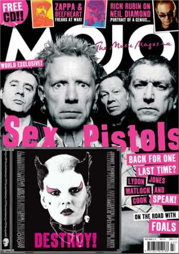
All of the lettering on the page is at differently, lopsided angles. This gives the page a disorientating feel which reflects the punk music of the Sex Pistols.
The magazine has 3 main colour: pink, black and white. This is good because it uses the rule of 3 and attracts people.
The rule of 3 is also used with the 3 different fonts used on the cover.
There is a free CD with the magazine which would persuade people to buy it.
It also includes a few small descriptions of the articles in the magazine to give readers an idea of what is in the inside.
The photo shows the Sex Pistols looking angry and gives off a rebellious atmosphere which I'd like to use in my magazine.
In my magazine cover I will use the rule of 3 with 3 main colours probably Black, white and blue, green or purple. I will also use small drop introductions to the articles on my cover.
No comments:
Post a Comment